Designing events for trust
The Power of Colour at Events
The rules of colour and how to use them to your advantage, enhancing event branding and live experiences,
We often barely notice the role colour plays in how we perceive our environments. It is so deeply ingrained in everyday life, from knowing when it’s going to rain to when to accelerate at traffic lights. It is used in marketing to influence sales as designers know colours dramatically affect perception, emotions and decision-making.
There’s no doubt the right choice of hues bring an event or space to life and create a memorable impression (our favourite colourful venue being Sketch in London), but it can do much more than that.
In this article, we will explore how Event Managers can use colours as a tool to improve audience experience, project a certain brand image and set the tone for an event.
Brand perception
For consumers confronted with advertising constantly, colour cues can be an unconscious message about what they should be buying and from whom. Buffer published that over 90% of our assessment of a product is made on colour alone.
Strengthening one’s brand image may be a goal, and some brands are instantly recognisable from colour alone. For example, the iconic Tiffany box is blue. The blue-clad Tiffany Cafe in Harrods instantly conveys luxury and the pop-up is an extension of the brand experience for consumers.
In honour of their 160th anniversary, HSBC collaborated with the Pantone Color Institute™ to create a customised colour story for its iconic visual identity shade of HSBC Red. Tied to HSBC values and vision, the colour messaging underscores the emotional connection between HSBC Red and the bank’s history. Appearing in HSBC’s house flag in the 1880s, HSBC Red is deeply rooted in the bank’s DNA. Highlighting a rich history from local beginnings to an international bank that serves millions, bold and dynamic HSBC red was deemed auspicious, signifying prosperity and good fortune in the bank’s home market of Hong Kong. A symbol of trust and protection to clients across the globe, HSBC Red harmonises strength with optimism.
Aesthetic
It’s a no-brainer that colour choice is integral to design and event styling. The colour wheel is useful to find shades that work together best and rule out those that don’t. A tip is to make sure they don’t clash with existing colours at the venue.
Complimentary palettes use opposite colours on the wheel.
Analogous palettes are made up of three shades next to each other on the wheel and creates a soft look.
Monochromatic palettes consist of different shades of the same colour for a clean look and to showcase important information in exhibitions.
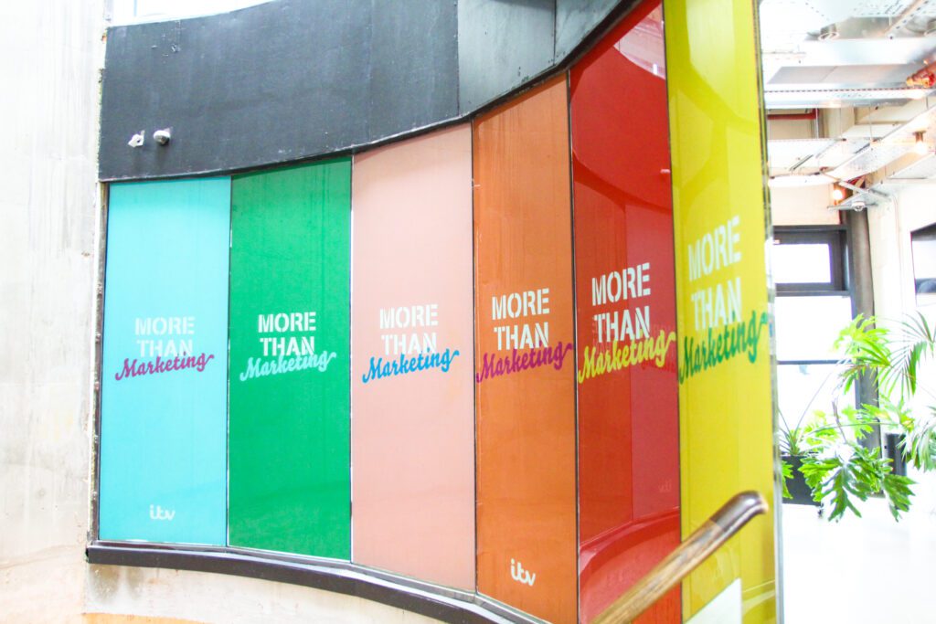
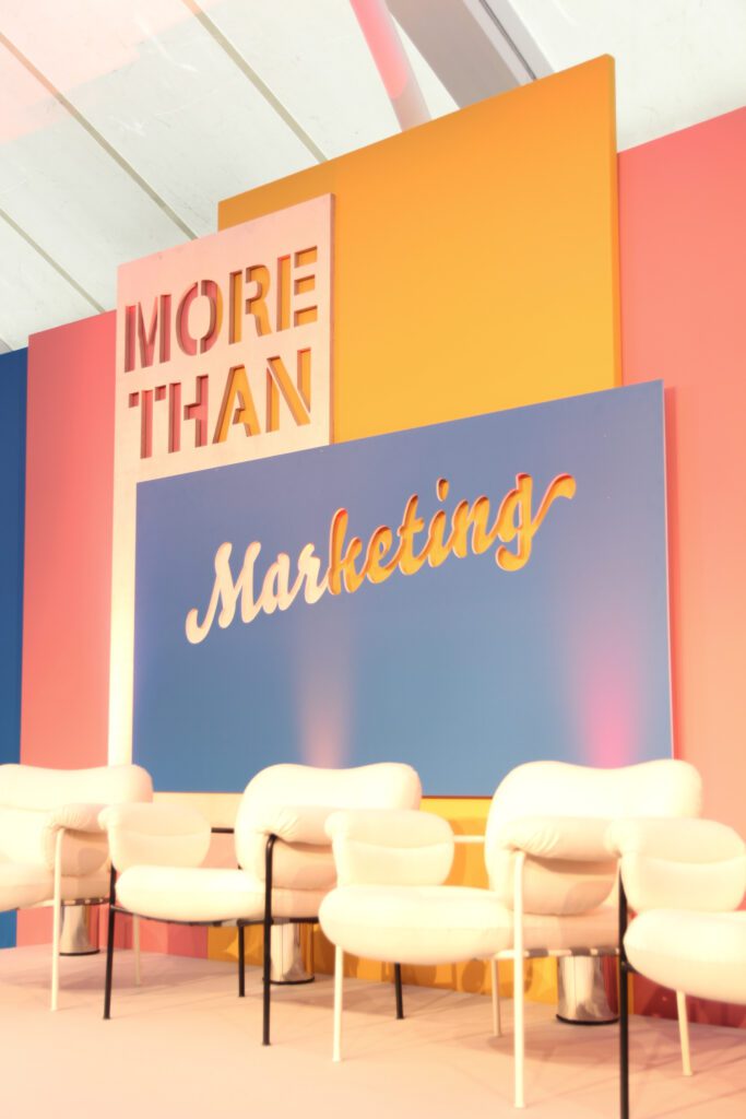
Triadic palettes are high contrast as they combine three colours equally placed around the colour wheel. This is best used against a neutral venue. This bold stage at Camden LABS featured a triadic palette with shades of blue, pink and yellow, which are equally spaced around the colour wheel.
Conveying a theme and purpose
Keep in mind the goal of an event. If the goal is to build loyalty to the brand, use familiar and timeless colours but if it’s to appear innovative and bold, consider using recent event trends such as Pantone’s colour of the year or Pinterest Palette – an annual drop of trending colours drawn from the ideas people are searching, saving and exploring on Pinterest.
The right tones remind the audience of what the event is all about and creates a talking point. There are clear connotations, such as using lots of gold for a Tutunkhamun Exhibition or red at a Christmas event, that are part of setting the scene and creating an immersive experience.
When it’s not so obvious, colours can be used to support the theme such as greenery at an event based on sustainability. When we attended an exhibition on sustainable events at the Barbican, the surroundings from the choice of a very green venue meant we felt immersed in the topic.
Dark and cool colours can create a sophisticated and professional feel, whereas warm, bold hues stimulate excitement for a high-energy event. You can make a space feel open and airy with a light palette or intimate with shadowy choices.
Colour can be key to engaging attendees both on-site and when building an event website or online promotion, which can be crucial to event turnout and participation.
Colour Psychology is the study of human responses to different hues.
Blue signals reliability and calm, with many brands using it to evoke trust and convey security. It can be found in over 75% of credit card brand logos.
While it has been found to be the world’s favourite colour, it is the least appetising as the brain recognises that so few foods are naturally blue. Maybe it’s not the best colour for a three-course meal but it is useful for financial conferences and learning environments, as it is proven to promote productivity and creativity.
Red is associated with excitement. It is bold and grabs your attention, so it is often used for a call to action such as ‘register now’ buttons. Red also signifies power, confidence and strength meaning it is great for corporate or executive events.
Green is associated with nature and health and can be relaxing and refreshing. Bring green to your events through plants to create an immersive environment.
Accessibility
Another consideration is accessibility. Certain colour combinations are confusing to those who are colour blind. Facebook’s established blue branding comes from the fact Mark Zuckerberg is Red-green colour blind. Readability is an important consideration as it can have a big effect on the experience of many event aspects such as presentations, menus, and signage for way finding.
For best practice all event designs should include contrast between content and background and avoid red and green combinations.
Keep the audience in mind
How appealing a colour is, depends on the subjective experiences of the intended audience and context. It is too much of a generalisation to say green just means calm when it is often associated with health in branding. Likewise, red means excitement but is also a sign of luck in China.
It’s impossible to pick a colour that is universally loved or one that will guarantee success, so it’s key to always focus on your audience demographic. Choose colour schemes with careful consideration rather than following your personal preferences.